18x increase in product adoption.
$48k in Annual Recurring Revenue generated through service fees.
Reduced support calls.
Increased product satisfaction through improved awareness.
Easier product differentiation.
Calling advice centre to upgrade accounts. Long wait times caused frustration, preventing adoption of our premium account tiers.
Basic account tier receives more complaints due to user dissatisfaction. Users on the lower-tier account pay a $1.50 fee for each Interac e-Transfer.
I began by conducting desk research on similar upgrade flows to understand common user pain points.
Users struggled to understand the value of upgrading.
The discoverability of the upgrade option was ineffective.
Most users wanted to know if they could revert to basic plan.
These insights informed potential design solutions for a smoother upgrade experience.
Desk Research
/
Scotiabank and Amazon Prime

#1 Self-serve digital upgrade experience
More members will complete account tier upgrades independently, reducing reliance on the Advice Centre and improving overall satisfaction.

#2 Improved visibility and education
Members in the lower tier will better understand their options and be more likely to consider upgrading, which will help reduce dissatisfaction.
Goal 1: Improve discoverability of the feature

Unlike all the platforms researched, I wanted to ensure this feature could be easily found on both platforms.
Ideation
/
Improving feature discoverability
Goal 2: Educating the user

Most of the current upgrade flows have nuances hidden behind walls of text, providing little helpful guidance to users. I wanted to ensure that users can make informed decisions.
Ideation
/
Educating the user
Goal 3: Help users in product differentiation

I chose to use a product card format to make it easier for users to differentiate between products. Designing for this goal involved incorporating extensive feedback from our legal and product teams.
Ideation
/
Product differentiation
Internal user testing revealed that vertical layout didn’t support easy product differentiation.
How did I tackle this?
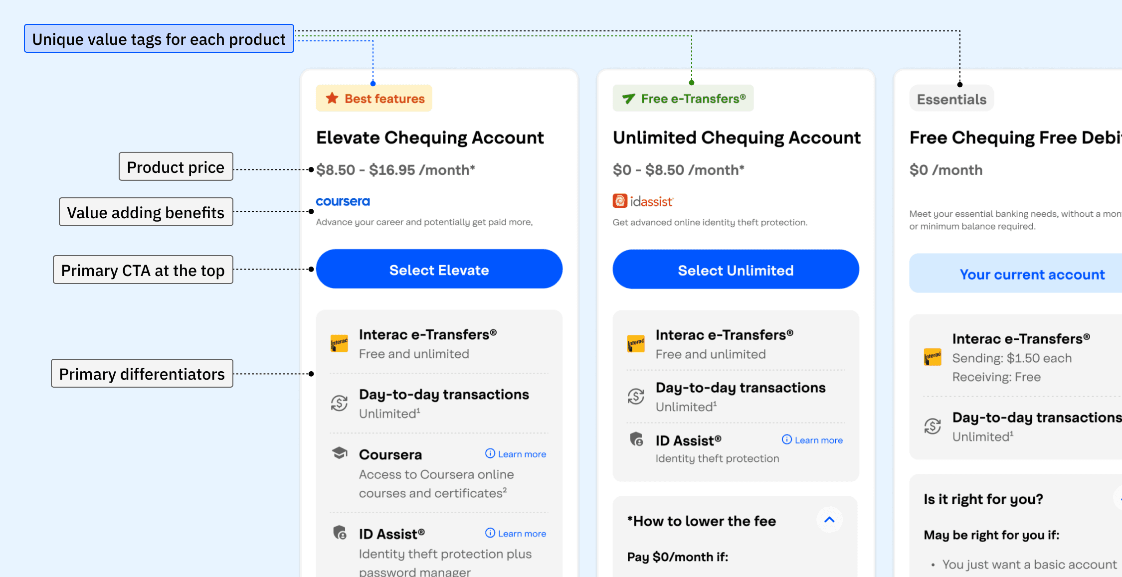
Secured buy-in for a new product comparison layout to improve the user experience of differentiating between products.
Challenge
/
Product card layout
Continuous feedback from Legal and Product Appropriateness teams led to added content, which increased page length and diminished the overall user experience.
How did I tackle this?
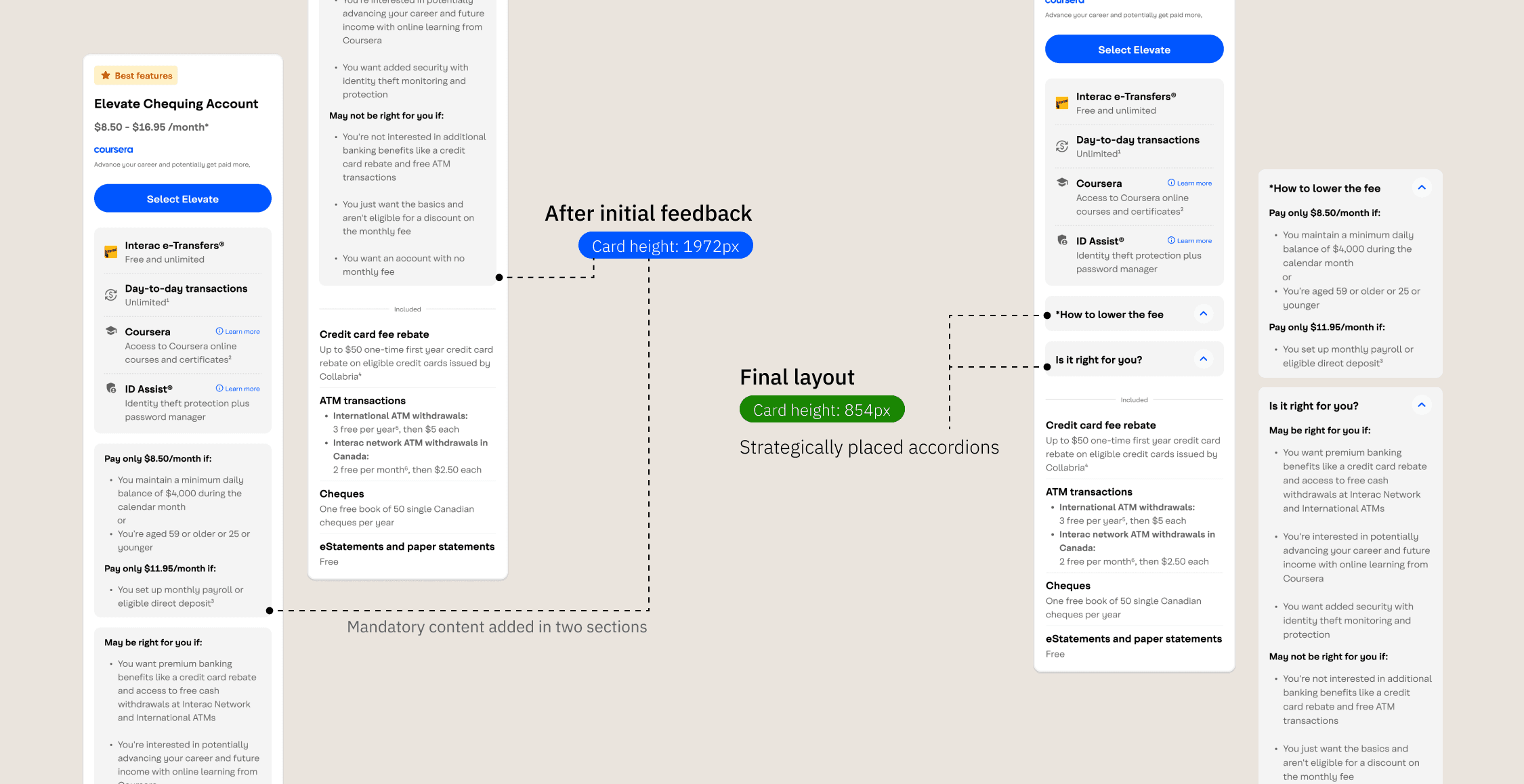
I worked with the content designer to reduce text wherever possible, made the account selection sticky, and organized dense information into meaningful accordions to avoid overwhelming users.
Challenge
/
Make page shorter with mandatory content
Stakeholders were still on fence about the discoverability of the feature.
How did I tackle this?
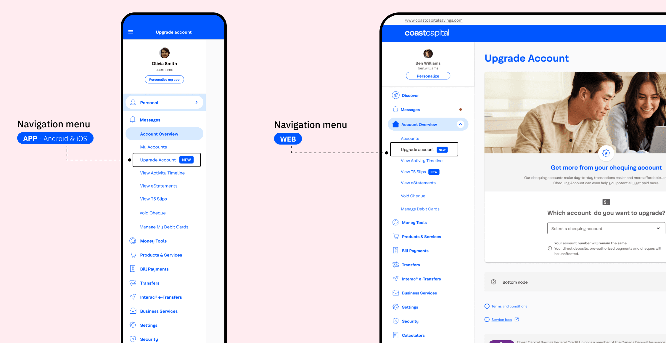
I added the feature right in the navigation menu and used tags to highlight the feature along with other promotional content.
Challenge
/
Easy discovery
Designed a digital banking experience that enables users to upgrade their account type seamlessly online.
This feature release addressed key pain points, including long wait times when contacting the Advice Centre, frequent complaints about Interac e-Transfer charges, and the limited benefits of the base account tier.
Some key stakeholders tend to provide feedback late in the process, which becomes difficult to accommodate once the design has entered the development sprint.
To ensure all stakeholders have visibility and provide sign-off before the sprint, I introduced a separate “Stakeholder Review” design file. This file allows stakeholders to review the final designs and mark their approvals before we proceed with the development handoff.
Review any anomalies like page drop offs and identify any potential issues that can be fixed through design.
Figure out a way to allow downgrading without impacting business outcomes.
Users could use a few loopholes to use the benefits of higher tiers if we allowed downgrading. So this feature was not included in this release.


